
The Challenge: Create infographics to represent data/info in differing ways.
The Process/Solution: I will cover this for each graphic below
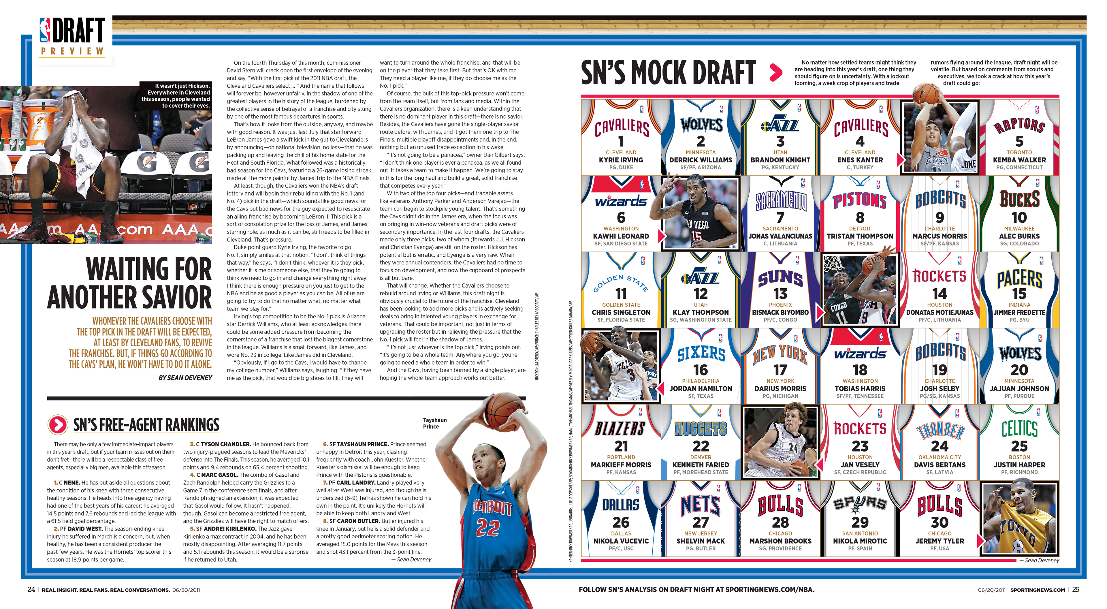
This is a mock draft infographic for Sporting News Magazine (right side page). I used vector images of the jerseys for the teams in the draft with the draft pick number where the jersey number would typically be, and the player's info below. Also sprinkled in photos of some of the draft prospects.
_________________________________
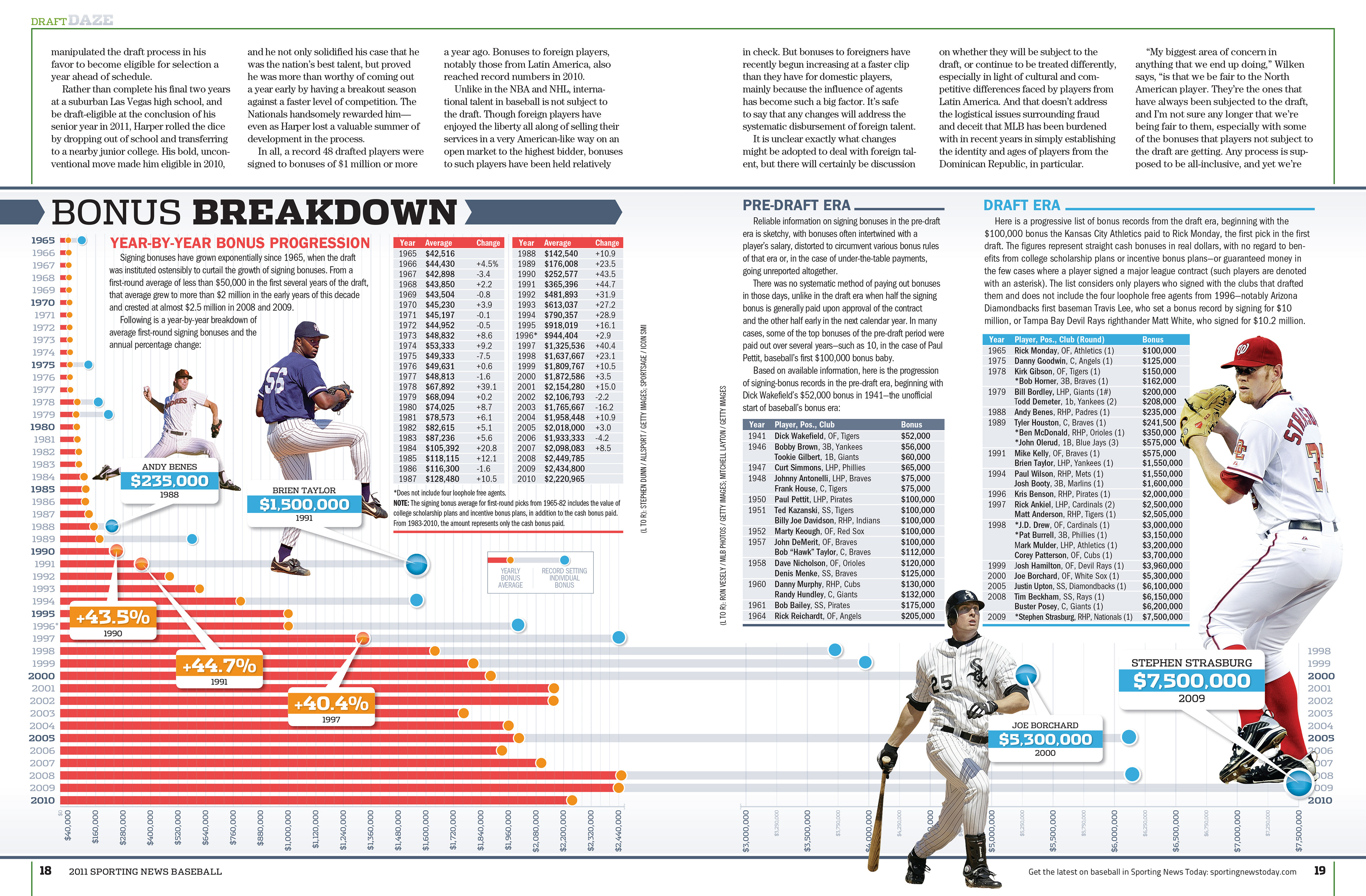
This is a large sidebar in a feature that is a breakdown of how large signing bonuses had gotten in professional baseball. The red lines show the average for the year and gray lines showed record setting individual bonuses. My art director really took a risk letting me develop this on my own but fortunately it turned out well for both of us. The layout changed quite a bit during the process because it was originally going to get its own full spread (without having to run the other story across the top) and editorial decided that the table showing the actual numbers (on the left page) needed to be added after the main layout was already done.
_________________________________
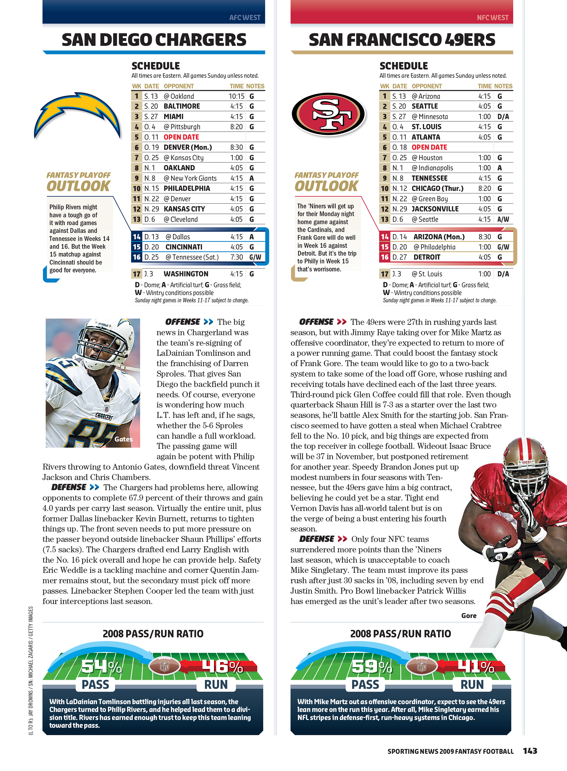
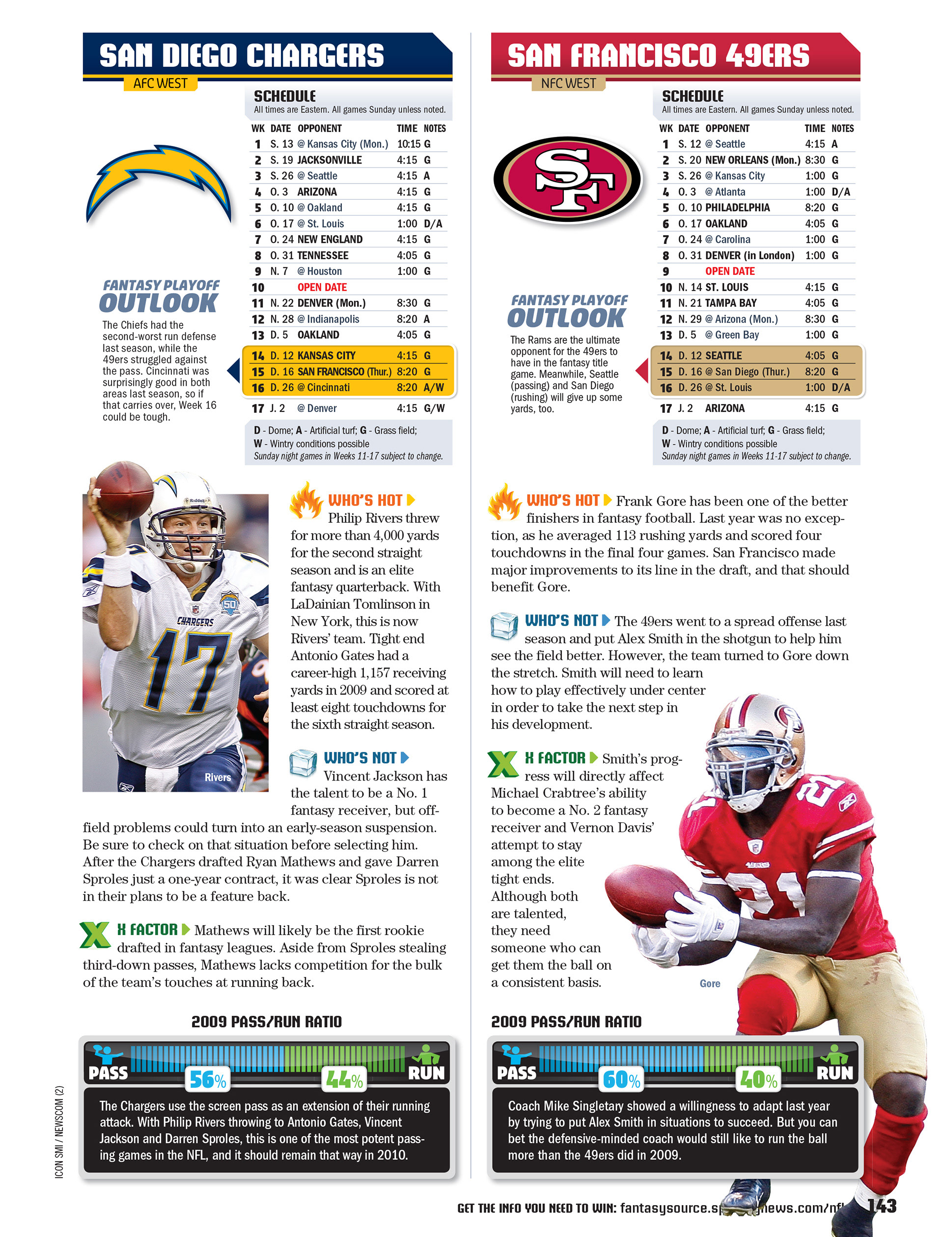
These two pages show graphics that I made to represent the run/pass ratio for NFL teams (at the bottom of each page). I had to create the look of the graphic and make sure that it was built in such a way that it could cover a range of different percentages. Each year we had to change it up and this shows two of the years that I was responsible for it.